
Choosing the right typefaces for your book
When readers open your book, they may not consciously notice the typeface (font) you’ve chosen, but it plays a significant role in how comfortable and enjoyable their reading experience is.
Good typography supports your words quietly and effectively. The right typefaces make your book feel professional, readable, and polished. The wrong ones can make even great writing feel difficult to read, and may stop a reader from finishing a book.
If you’re self-publishing, choosing the right typefaces is an important step in creating a book readers will enjoy. So, here are some key considerations to help you make the right choice.
Why typefaces matter in book design
Typefaces are about much more than appearance. They influence:
Readability
Professional presentation
Reader comfort
The tone of your book
When typography is well chosen, readers absorb your words without distraction. When it isn’t, they may struggle with spacing, letter shapes, or visual fatigue.
Good typography allows the reader to focus entirely on the story or message.
Serif versus Sans Serif: What’s the difference?
One of the first choices to consider is whether to use a serif or sans serif typeface.
Serif typefaces
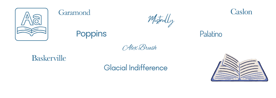
Serif fonts have small strokes (called serifs) at the ends of letters. Common examples include: Garamond, Baskerville, and Times New Roman.
Serif fonts are widely used in printed books because they guide the eye along lines of text, making them comfortable for long reading sessions. For this reason, serif typefaces are the most common choice for book interiors.
Sans Serif typefaces
Sans serif fonts do not have the small strokes at the ends of letters. Examples include: Helvetica, Arial, and Calibri.
These fonts are often used for headings, titles, or digital content because they appear clean and modern. In books, they are sometimes used for: chapter titles, headings, and non-fiction elements such as tables.

Having said the above, with the wide range of fonts now available, the choice is endless, and chapter titles and headings are often presented in a handwritten-style font. Really, the choice is yours, and your typesetter will give advice, but ensure the choices and combinations are comfortable to read.
Many now feel that sans serif fonts are more accessible; there’s no one-size-fits-all solution, no one right way. The best font for you, your brand or your publication depends on what you want your designs to say to your audience, so choose fonts that feel like you.
Prioritise readability
Above all else, your typeface should be easy to read for long periods.
Look for fonts that have:
Clear letterforms
Comfortable spacing
Distinct differences between similar characters (such as l, I, and 1)
Balanced proportions
Many professionally designed book typefaces have been carefully created with readability in mind.
Choose a typeface that matches your genre
Typography also contributes to the tone and feel of your book. For example:
Literary fiction and historical novels often use classic serif fonts.
Modern non-fiction may combine a serif body font with a clean sans serif for headings.
Children’s books may use more playful, accessible fonts.
Business or academic books often favour clarity and structure with traditional typefaces.
The goal is consistency between the book’s visual design and its content.
Don’t use too many typefaces
A common mistake in book design is using too many fonts. Professional book layouts usually use:
One typeface for the main body text
One complementary typeface for headings or chapter titles
Keeping typography simple helps maintain visual consistency and prevents distraction.
Size and Spacing matter too
Choosing a typeface is only part of the process. Good typesetting also considers:
Font size
Line spacing
Margins
Paragraph indents
Even a beautiful typeface can feel uncomfortable if the spacing or layout isn’t balanced properly.
This is why professional typesetting is such an important part of the publishing process.
Test before finalising
Before settling on a typeface, it’s worth reviewing a few sample pages. Ask yourself these questions:
Does the text feel comfortable to read?
Does the page look balanced?
Does it suit the tone of the book?
Does it still look good when printed?
Seeing the text in context helps ensure the typeface truly works. Your typesetter should provide you with sample pages set with different font combinations.
Why professional typesetting helps
Typography and layout involve a surprising amount of detail. Professional typesetting ensures:
Consistent typography
Balanced pages
Comfortable reading flow
A polished, professional finish
Professional typesetting transforms a manuscript into a book that looks as good as it reads.
Final Thoughts
Readers may not consciously notice your typeface, but they will certainly notice if something feels difficult or distracting.
Choosing a clear, appropriate typeface and combining it with thoughtful typesetting creates a smooth reading experience and gives your book the professional presentation it deserves.
If you’d like support with typesetting or preparing your manuscript for publication, I’d be happy to help guide you through the process.
I hope this helps xx
If you’re an aspiring author looking to publish your book, I'm here to polish your words and create a professional, reader-friendly publication for you. I would love to support you on your publishing journey.
Contact me for an editing and typesetting estimate; let’s make your book shine!
* * *
Cornerstone pa services is here to help YOU and YOUR business.
Get in touch if you need editorial or admin support.