
Desktop Publishing: What makes a professional publication?
This blog follows on from my earlier blog: Desktop publishing: From PageMaker to Professional Book Typesetting.
Desktop publishing has made it possible for almost anyone with a computer and the right software to create printed and digital documents. But having access to the tools doesn't necessarily mean you know how to use them effectively. There is a big difference between putting words and pictures onto a page and creating a publication that looks professional, is easy to read and communicates its content effectively. As someone who has worked with desktop publishing since the 1980s, I know just how much thought goes into the latter.
What does Desktop Publishing involve?
Desktop publishing, often abbreviated DTP, is the process of creating documents using computer software that combines text, images, typography and page layout.
It can be used for almost anything, including:
Books and ebooks
Magazines and newsletters
Brochures and leaflets
Reports and business documents
Workbooks and manuals
Catalogues
Programmes
Marketing materials
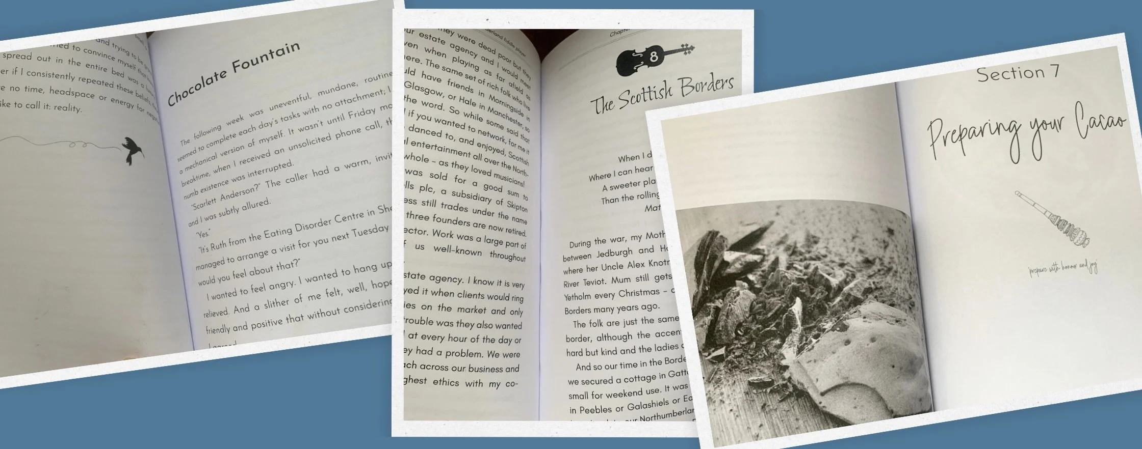
For an indie author, desktop publishing is particularly important when turning a manuscript into a finished book. Your manuscript contains your words, but typesetting determines how those words appear on the page.
It's not just about making things look pretty
Good desktop publishing isn't simply about choosing a nice font or adding attractive images. Every element should have a purpose.
The layout needs to guide the reader naturally through the content. Typography needs to be comfortable to read. Headings should be clear and consistent, images need to be positioned appropriately, and pages should have enough white space to avoid feeling cluttered.
There are also plenty of technical considerations that a reader will never see but are essential to producing a professional publication. These might include:
Page size and margins
Paragraph and line spacing
Consistent styles
Page numbering
Headers and footers
Chapter openings
Image resolution
Bleed and margins where appropriate
Front and back matter
Print-ready PDF requirements
Getting these details right helps create a seamless reading experience.
Why does typography matter?
Typography is one of the most important parts of any publication.
The typeface you choose, its size, spacing and placement can dramatically change how a document feels. A font that looks wonderful on a computer screen might not be suitable for several hundred pages of printed text.
For a book, readability should always come before novelty. Your chosen typeface needs to complement the genre and tone of your book, while allowing the reader to focus on the story or information rather than the letters on the page.
This is one reason professional typesetting can make such a difference. It's not simply about choosing a font; it's about understanding how typography works across an entire publication.
Consistency is key
One of the easiest ways to make a document look amateurish is inconsistent formatting.
Imagine a book where one chapter heading is centred, another is aligned left, and another uses a completely different font. Or where some paragraphs have indents while others don't, and spacing changes throughout the book. These might seem like small details, but they interrupt the reader's experience.
Professional desktop publishing software allows styles and formatting to be applied consistently throughout a document, making it much easier to maintain a cohesive appearance.
Choosing the right software
There are many desktop publishing tools available, from relatively simple online design platforms to sophisticated professional software.
There are several software options available; the most popular tools are focused on page layout, image manipulation, and typography. Here are some of the key tools that help make DTP a reality:
Adobe InDesign: Adobe InDesign is the industry-standard software for desktop publishing. It’s a powerful tool designed for creating multi-page documents such as magazines, brochures, e-books, and reports. With InDesign, users can control everything from the layout and spacing to fonts and colours, offering unparalleled flexibility and precision. It also integrates seamlessly with other Adobe products, like Illustrator and Photoshop, making it a go-to choice for professionals.
Affinity Publisher: For those who need a professional-level tool without the subscription model of Adobe, Affinity Publisher offers a strong alternative. It is similar to InDesign in terms of functionality and is packed with powerful features, including advanced typography control, layout grids, and integration with Affinity Designer and Affinity Photo.
Microsoft Publisher: For those just starting or needing simpler layouts, Microsoft Publisher is a great entry-level option. It’s user-friendly and offers an assortment of templates to help you create flyers, newsletters, business cards, and other documents. While not as feature-rich as Adobe InDesign, Publisher is still a reliable tool for small businesses or individuals looking to create printed materials.
Canva: Canva has emerged as a highly popular design tool, especially for beginners and non-designers. It offers an intuitive drag-and-drop interface with pre-designed templates that help users quickly create anything from social media posts to print materials. While it’s not as robust as InDesign for complex print layouts, Canva’s ease of use and accessibility make it an excellent tool for digital and print projects.
I use Affinity Publisher for my typesetting work because it gives me the level of control I need over typography, styles, layout, images and page design.
Tools such as Canva are fantastic for many types of visual content, particularly social media graphics and simple marketing materials. However, a multi-page book requires a different level of control and precision.
The right tool depends on what you're creating.
Templates can help, but they aren't everything
Templates can be a great starting point, particularly for simple publications. They can save time and provide a basic structure to work from. However, simply dropping your content into a template doesn't necessarily produce a professional publication. Every book is different.
Whether it’s a novel, a poetry collection, a memoir, an illustrated children's book or a non-fiction guide, each has different requirements. The layout needs to work with the content rather than forcing the content into a predetermined design.
Think about your reader
Perhaps the most important consideration when designing any publication is the person who will eventually read it.
Ask yourself:
Will this be comfortable to read?
Can the reader easily navigate the content?
Does the design suit the subject matter?
Do the images and typography enhance the content?
Good desktop publishing should make reading easier, not harder. Ideally, the reader shouldn't be thinking about the layout at all; they should be able to immerse themselves in the words without any distractions.
Tips for effective desktop publishing
Here are a few tips to consider if you’re going to try desktop publishing/typesetting yourself:
Use templates: Many DTP programs come with templates to help get you started. While it’s tempting to design everything from scratch, templates can save you time and provide a strong foundation for your project. You can always customise them to reflect your unique style.
Pay attention to typography: Typography is one of the most important aspects of desktop publishing. The right font can elevate a design, while poor font choices can detract from it. Stick to one or two complementary fonts and ensure readability, especially when designing for print.
Keep it simple: Less is often more. Avoid overcrowding your design with too much text or too many images. Focus on a clean, organised layout that guides the viewer’s eye naturally.
Consider your audience: Always keep your target audience in mind. Are you designing a corporate brochure or an artistic flyer for a local event? The tone, design, and layout should align with the expectations and preferences of your audience.
Export in the right format: Finally, make sure to export your document in the correct format for printing or digital distribution. Common print formats include PDF and EPS, while digital designs may require JPEG or PNG formats for web use.
When should you consider professional help?
If you're creating a simple flyer or social media graphic, you may be perfectly happy designing it yourself. But if you're preparing a book for publication, professional typesetting can save you considerable time and help ensure your finished book looks polished.
You may know exactly how you want your book to look, or you may have absolutely no idea where to start. Either way, a professional typesetter can help turn your manuscript into a publication-ready interior and take care of the many technical and design details along the way.
From Manuscript to Finished Book
This is the part of my work I particularly enjoy.
An author has spent months or even years creating and perfecting their manuscript. My role is to help transform those words into a finished book.
That involves much more than simply making the pages look attractive. It's about understanding the content, choosing appropriate typography, creating a consistent layout, checking the finer details and preparing the final files for publication.
The technology may have changed enormously since my PageMaker days, but the principle remains the same: good desktop publishing brings words and design together to create something readers can enjoy.
If you've written your book and are ready to take the next step, I'd love to help with the typesetting and formatting of your manuscript.
Your words 💙 My help.
I hope you found this interesting xx
If you’re an aspiring author looking to publish your book, I'm here to polish your words and create a professional, reader-friendly publication for you. I would love to support you on your publishing journey.
Contact me for an editing and typesetting estimate; let’s make your book shine!